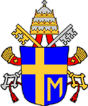
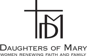
 The Daughters of Mary introduced a logo, which was inspired by the coat of arms of Blessed John Paul II, who has been referred to as a “very Marian Pope.” Blessed John Paul’s coat of arms featured an “M” beneath the right arm of the Cross. The “M” referred to Mary’s station at the foot of the Cross, signifying her vocation as Mater Dolorosa, Mother of Sorrows.
The Daughters of Mary logo features a “D” that interconnects to the “M” to signify the hope that this group of faithful women will sustain the “exceptional link to Mary,” which John Paul II wrote about in his apostolic letter, Mulieris Dignitatem—On the Dignity and Vocation of Women.
 The Daughters of Mary seek to embrace and adapt the Marian tradition in ways that can be appropriated by women of our time, women who face a world that is complex and challenging, and constantly changing. Creating a symbol the would appeal to “real” women who lead “very real” lives was singularly important to the Coeur Committee, who discerned for several months before deciding upon a monogram. The DoM symbol has a contemporary simplicity rather than the ornate design of the Middle Ages. The Daughters of Mary find the monogram meaningful and quite appealing because it speaks to their identity as women of prayer and compassion.
